Rebranding a CCA for Greater Impact
Problem
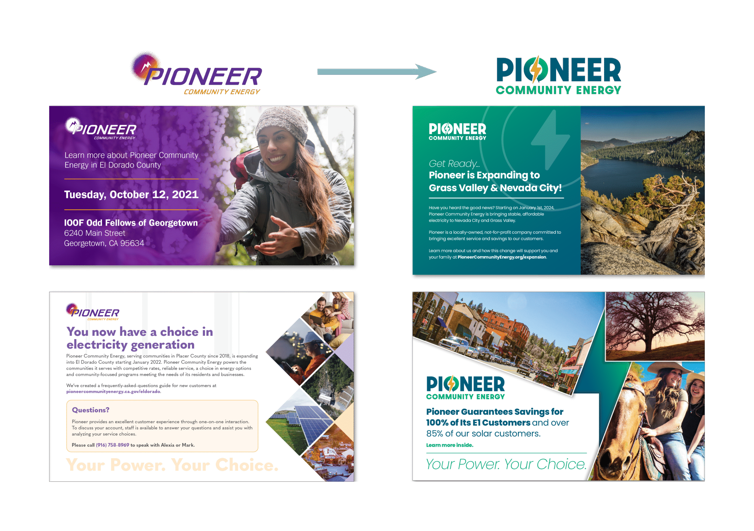
Pioneer Community Energy (Pioneer) is a community-owned, not-for-profit Community Choice Aggregation (CCA) agency serving parts of North Eastern California. Despite providing affordable and reliable energy options, Pioneer faced brand recognition challenges, with a significant percentage of customers either unaware of the organization or confusing it with PG&E.
The existing brand, established in 2017, did not effectively communicate Pioneer’s values or differentiate it from investor-owned utilities. A previous brand update in 2021 made some strides toward trust and approachability, but internal stakeholders and customers expressed a desire for a more refined, mission-aligned brand identity. Pioneer engaged JSR Strategies to develop a new brand that would reinforce its strategic goals and better connect with its audience.
Goal
- Evolve Pioneer’s brand to reflect the values outlined in its updated strategic plan.
- Create a visual identity that differentiates Pioneer from PG&E while reinforcing its mission of being a community-first energy provider.
- Enhance public perception by ensuring the brand communicates trust, reliability, and affordability.
- Establish a cohesive look and feel through a new logo, color palette, and typography.
JSR Strategies took a structured approach to Pioneer’s rebranding, ensuring alignment with stakeholder expectations and community sentiment. Key initiatives included:
- Stakeholder Research & Insights: Conducted surveys and internal interviews to understand pain points and aspirations for the new brand.
- Brand Positioning & Messaging Refinement: Maintained Pioneer’s core mission, vision, and values while ensuring they were clearly communicated through the new identity.
- Competitive Analysis: Reviewed regional and industry competitors to ensure Pioneer’s new brand stood apart while maintaining credibility within the energy sector.
- Visual Identity Development:
- Logo Design: Created multiple iterations with a focus on trust, reliability, and community impact. Explored nature-based elements such as trees and leaves, per client preference.
- Color Palette: Shifted away from purple and brown, introducing greens and blues that evoke trust, sustainability, and stability while avoiding PG&E’s color schemes.
- Typography: Selected modern, professional, and accessible fonts that align with Pioneer’s tone and brand personality.
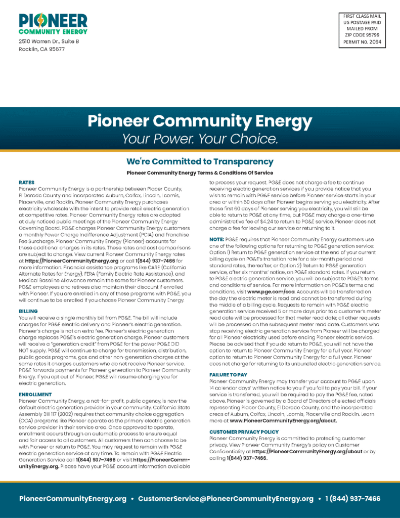
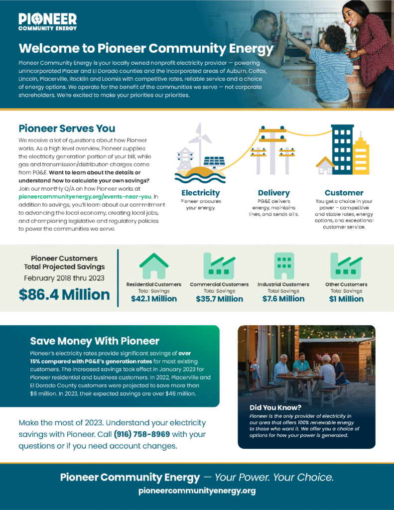
- Moodboards & Style Guide: Developed a comprehensive brand guide to ensure consistency across all communications and marketing materials.
- Implementation Strategy: Developed an asset redevelopment plan to seamlessly transition the new brand across digital and physical platforms.
Brand Identity


Results
Through a strategic and research-driven approach, JSR Strategies successfully rebranded Pioneer Community Energy to better align with its evolving mission, improve customer recognition, and strengthen its competitive position in the energy sector. The new brand identity now serves as a powerful tool in Pioneer’s efforts to expand and build lasting community trust.