Renovación de la marca de una CCA para un mayor impacto
Problema
Pioneer Community Energy (Pioneer) es una agencia comunitaria sin fines de lucro de la Agregación de Opciones Comunitarias (CCA) que presta servicios en zonas del noreste de California. A pesar de ofrecer opciones de energía asequibles y confiables, Pioneer enfrentó dificultades para reconocer su marca, ya que un porcentaje significativo de clientes desconocía la organización o la confundía con PG&E.
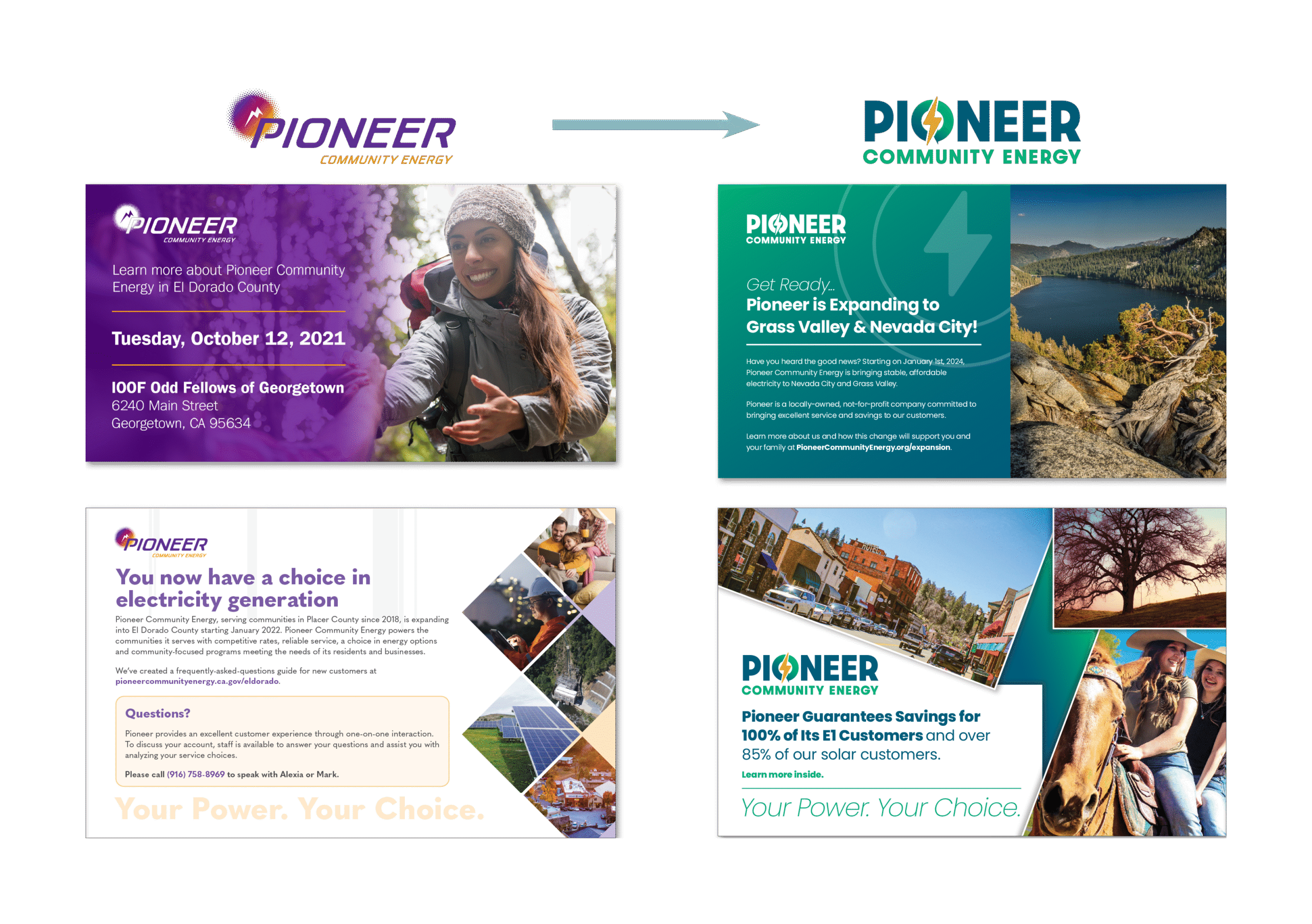
La marca existente, establecida en 2017, no comunicaba eficazmente los valores de Pioneer ni la diferenciaba de las empresas de servicios públicos propiedad de inversores. Una actualización de marca previa, realizada en 2021, logró avances en la confianza y la accesibilidad, pero las partes interesadas internas y los clientes expresaron el deseo de una identidad de marca más refinada y alineada con su misión. Pioneer contrató a JSR Strategies para desarrollar una nueva marca que reforzara sus objetivos estratégicos y conectara mejor con su público.
Meta
- Evolucionar la marca Pioneer para reflejar los valores delineados en su plan estratégico actualizado.
- Crear una identidad visual que diferencia a Pioneer de PG&E al tiempo que refuerza su misión de ser un proveedor de energía que prioriza a la comunidad.
- Mejorar la percepción pública asegurándose de que la marca transmita confianza, fiabilidad y asequibilidad.
- Establecer una apariencia cohesiva A través de un nuevo logotipo, paleta de colores y tipografía.
JSR Strategies adoptó un enfoque estructurado para la renovación de la marca Pioneer, garantizando la alineación con las expectativas de las partes interesadas y la opinión de la comunidad. Las principales iniciativas incluyeron:
- Investigación y perspectivas de las partes interesadas: Realizó encuestas y entrevistas internas para comprender los puntos débiles y las aspiraciones de la nueva marca.
- Posicionamiento de marca y refinamiento del mensaje: Mantuvo la misión, la visión y los valores centrales de Pioneer y al mismo tiempo se aseguró de que se comunicaran claramente a través de la nueva identidad.
- Análisis competitivo: Analizó a los competidores regionales y de la industria para garantizar que la nueva marca de Pioneer se distinguiera y mantuviera la credibilidad dentro del sector energético.
- Desarrollo de identidad visual:
- Diseño de logotipo: Se crearon múltiples iteraciones con énfasis en la confianza, la fiabilidad y el impacto en la comunidad. Se exploraron elementos naturales como árboles y hojas, según las preferencias del cliente.
- Paleta de colores: Se alejó del púrpura y el marrón, introduciendo verdes y azules que evocan confianza, sustentabilidad y estabilidad, evitando al mismo tiempo los esquemas de colores de PG&E.
- Tipografía: Fuentes modernas, profesionales y accesibles seleccionadas que se alinean con el tono y la personalidad de la marca Pioneer.
- Tableros de estado de ánimo y guía de estilo: Desarrolló una guía de marca integral para garantizar la coherencia en todas las comunicaciones y materiales de marketing.
- Estrategia de implementación: Desarrolló un plan de reurbanización de activos para realizar una transición sin problemas de la nueva marca en las plataformas digitales y físicas.
Identidad de marca


Resultados
Mediante un enfoque estratégico basado en la investigación, JSR Strategies renovó con éxito la marca Pioneer Community Energy para alinearse mejor con su misión en constante evolución, mejorar el reconocimiento de los clientes y fortalecer su posición competitiva en el sector energético. La nueva identidad de marca ahora constituye una herramienta poderosa en los esfuerzos de Pioneer por expandirse y generar una confianza duradera en la comunidad.